Chaitrali Fegade
Khandeshi Food Culture
Illustrated Recipe Book
The Idea
This project started with a conversation I had with my friend who was invited to my house for lunch. We set to talking about the recipes we grew up with and how differently they were interpreted across different generations, regions and cultures. I wanted to revisit the stories I grew up with around food and share them with people who share the same curiosity.
Is it just about the recipe?
“What would you like to know about the food you are trying for the first time?”


“How do you react when you like a dish?"
“What is your favourite food item and why?”
It was a pleasant surprise to see how passionately people responded to these questions and the memories they associate with it.
It helped me decide the book was to answer the general questions about the recipe as well as caveats about practices and customs around it.
It made for an introduction to the dish and a tiny peek into the vast collection of stories it carried being passed down with so much love through generations.
Visual style and decisions
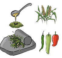
I chose to use Illustration as a medium for this food guide for reasons(other than having a personal liking for it) because it allows interpretation of the imagery by both the artist and the viewer as per their own imaginations, it is more memorable and emotion-evoking.
It also allows for flexibility to show all the graphics, be it vegetables, utensils, fire or an action of the process- in a coherent way across the pages.
Cover Design
Some Initial sketches


Final book cover design
-
It had elements like a widely used tool, and the human hands using it in action that were used to capture the essence of the book, which is about the preparation of the food items as well the narrative of the people preparing them.
-
Fonts used were- Delius Swash Caps (title), Dosis (subtitle) and Edu SA Beginner (body of text)
-
The colors used in the background were shades of the soil found in the Khandesh region, drawn in waves with gritty edges to depict the earthiness and spice of the beloved cuisine.

Page Content
I considered the following while structuring the pages:
-
Establishing a clear heirarchy in the content.
-
While the framework varies a little between each page as the content differs, the text format is consistent to make it easy for the viewer to find exactly what they are looking for in each dish.
-
Utilizing the right-sided page for the Illustrations as well as the names of the main food items at a quick glance.
-
Simplified content as well as structure to relay a lot of information without overwhelming the reader.
-
As taste is personal and the research showed different ways of describing it, ensuring that opinions were stated to be so while also keeping the stories from sounding too depersonalised.
With these points in mind, I started by blocking out the space on the page for the information.


The final layout of the page spread
-
The ample negative space makes it easier to navigate the textual matter and provides breathing space.
-
The right side features an illustration of how the food item is likely to be served with all the names of the side dishes as well. The background her is a neutral toned colour to make the illustration stand out.
-
Fonts used: Delius Swash Caps (title), Amaranth (headings) and Edu SA Beginner Medium (body of text) and Kalam (marathi heading)
-
The bullet points are depicted by a halved peanut as it is one of the most commonly used ingredient across the cuisine.
-
The edges of the right sided page are marked by lines inspired by Rangoli design as an ode to the cultural practice.
Illustrations
I wanted to depict the texture of the food as well as the color to depict the soulful flavors of the dishes and ingredients, which is why I chose bright colors paired with an overlay of sketchy lines to depict the gritty surfaces.
I also referenced the lighting in the photographs used in food magazines to make the food look tempting and delicious.


The main dish illustration
-
The painting uses bold outlines and strong shadows in the parts in shadow to make the food items stand out. The bachground color is also a picked for the same purpose.
-
The style is sketchy and rough-edged to compliment the authentic flavours of the food.
All Pages

Front and back cover

Intro and Table of Contents

Glossary and Acknowledgements
Front and back cover
Use the arrows
to view the pages
Key Learnings
1. Information Gap
-
While conducting the primary research I found there to be a lack of information, which is to be expected about many such regional cultural food and cultural practices. I turned to secondary research methods and some methods new to me like old tv shows and news articles. I am glad I could take up this project and hope to do more such work going ahead.
2. Synthesizing data
-
I found all the data required to be scattered, some in books written in marathi, hindi or even kannada; some in vlogs or blogs, some in other media formats.
-
An old tv show ‘Amhi saare khavaiyye’ proved to be really helpful in my research as they covered several of these recipes while touring the region.
-
Converging all these points into coherent, interesting and yet crisp textual data at the end was the main challenge. I also conducted A/B testing to find what most people would prefer to know and the 'Accompaniments' section was added post the testing.
3. Semantics
-
Food, taste, cultural practices can be very personal and are described in a variety of ways. For example if a dish was stated to be ‘very spicy’ by someone it would factor in their spice tolerance, conditioning, etc. I had to ensure not to be influenced by such subjective preferences and yet the story should not sound as if narrated robotically.
-
I found that different languages allow different liberties to be taken for such descriptions and adopted some of their words in my text.
-
I added a glossary at the end to ensure clarity, consistency and comprehension.
This project was crafted in 4 months and the tools used were: Adobe inDesign, Adobe Photoshop, and Procreate.
I would be delighted to hear any thoughts or suggestions regarding this project from you! Please feel free to drop in a mail. Thank you!