Chaitrali Fegade
UC Play
Preschool Chain Business
Project Context
I was approached by the marketing head of the business to redesign their website landing page, the digital face of their business.
The scope included reframing the architecture to make communication more effective and build trust with the customers.
-
Project duration: 6 months
-
Scope: UX Research, Branding and Content design, and Landing Page design
-
Industry: Education

Current pain points
-
Users reported difficulty in navigating different sections of the website. Need an upfront way to provide important information.
-
Cluttered and too much text in certain sections of the website.
-
Brand values not clearly mentioned.
-
Hero section turnover insufficient. High abandonment rate from landing page.
-
Several parents preferred calling the business instead of using the website for tasks.
Opportunities
-
Create an attractive hero section on the landing page to increase retention.
-
Design the website as expected by the parents and understand their requirements for their children. Prioritize what is to be communicated accordingly.
-
Use icons and images to simplify communication of data and make it more interesting.
-
Make the information architecture clear and navigation easy by clarity in nomenclature, systematic sections for different types of information and consistency throughout the website.
Initial ideas
-
We came up with a few sketches and low fidelity wireframes about how we can section our landing page.
-
The Banners for events, workshops and important announcements were to be placed at the top, in an auto-scrolling carousel.
-
The next section would be the one that answers the question of why would a parent pick UC Play? Their brand values had to be highlighted here.

Banner Design
-
The banners needed to be attractive as they were the centre of attention in the hero section. After trying a few layouts, we decided illustrative banners worked best as even the children will be viewing them and it creates excitement.
-
The banners would differ event-wise but we needed to set some contraints to make it easy to perform the main task. These constraints were-
-
Same CTA button. So that it is easy to spot while scrolling through the banners.
-
Only one banner at a time to be displayed, otherwise the vibrant colors may clash.
-
Textual hierarchy in the banners to be maintained.
-


Final banner design
I proceeded by conducting user interviews next. I interviewed guardians using the website currently as well as those who had never used it to understand their problems and expectations.
User Interview findings and insights
-
It takes a while to find the schedule for the new batches starting admission. They would like to see the dates for the batches and fill the form immediately.
-
Event banners do not have links but just text. They have to copy the text which is a hassle. They would like CTA buttons to redirect to the relevant page.
-
Although it is a children’s school website, the primary users are parents and the colorful depiction can be undesirable if done in excess. The age group of the parents/guardians was from 25-50 years of age and they are used to minimally designed sleek websites at work.
-
If they are trying to find out more about the school, it is difficult to read through big blocks of text in the About section. They want to know the benefits provided by the school shown clearly.
-
Key tasks performed through website:
-
Registration for upcoming events
-
Admission form filling
-
Checking the schedules for classes or events
-
For referring it to their friends or acquaintances
-
-
Most of the users were working and busy, already facing stress and they wanted the website to make it as easy as possible for them to finish their tasks.


Brand Communication and Relationship building
-
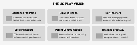
The major problem we decided to address first was the lack of communication of the brand's vision, principles and merits to the parents.
-
After discussions with the business side, I understood ways in which they were solving problems and concerns like security, trust, and many more. We summed the solutions and strategies into 6 major points.
-
We used simplified graphics relevant to each point to convey them. Below are a few iterations of the graphics.


Final design of the section
Visual design decisions
-
An issue faced here was whether to use the visual language a preschool website would have or the one a guardian would prefer to use? They seemed quite different.
-
We decided to meet halfway and came up with the following features:
-
Rounded edges (friendly vibe as well modern looking)
-
Don’t be afraid to make it colorful! However, the colors do not have to be bright and clashing. We used a single bright color in each section and subtle, softer hues of the same color to accent it.
-
Making use of shapes to add playfulness.
-
Accessibility checks. We ensured all the data was easily legible and the buttons were highlighted.
-
We incorporated the brands main colors which were blue and yellow in a way that made them stand out.
-
Clearly established and consistent hierarchy to make navigation easy.
-
We gave a lot of breathing space in the design by using ample amount of padding and spaces.


The landing page
Takeaways
-
Bridging the communication gap between the business and the customer as a designer. Making use of the impact of visual elements to impart emotions.
-
Cognitive load and retention. Directing the process to perform any task through the easiest way possible will leave a positive impression.
-
Leveraging colors and shapes to create great experiences.